34+ Presentation Templates
Applied by AI, Ready in Minutes
Every template is designer-built, spanning business, creative, minimal, editorial, retro, and playful styles. Pick a style, chat with AI for 5 minutes, and get a web presentation ready to share.
Business3 templates
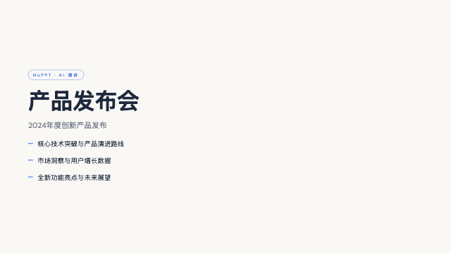
Blue Professional
Blue Professional lays electric cobalt accents over a calm cream-paper background for a clean, modern business look that never feels cold. It is the workhorse of the NoPPT library: clear headline hierarchy, restrained color, disciplined spacing, and chart-friendly layouts that make quarterly numbers and project plans easy to follow. If you need one template that works in almost any professional meeting, this is the safest strong choice.
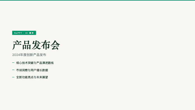
Emerald Editorial
Emerald Editorial is a magazine-cover treatment for business content: emerald green, deep navy, and paper white under a bold Bodoni-style display serif. It makes strategy look like something worth reading — every section opener has cover-page presence, yet the inner layouts stay disciplined enough for real metrics and roadmaps. For leaders who want authority with visible taste, this is the template.
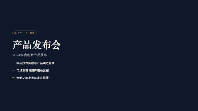
Signal
Signal is institutional weight rendered in design: a deep navy canvas, bone paper panels, and a single muted-gold accent applied like a wax seal. Nothing here is casual — high density and high formality serve documents where every line may be scrutinized. It is the NoPPT template most often chosen for the rooms where decisions get made, because it looks like it belongs there.
Minimal4 templates
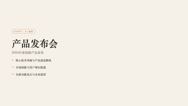
Cartesian
Cartesian is a quiet, warm-neutral template set in classical Playfair serifs — tasteful, unhurried, and deeply readable. There are no loud accents; hierarchy comes from type scale, spacing, and a disciplined grid, the way a well-set book earns attention. Low density gives long-form arguments room to unfold across slides. It is the NoPPT template that most resembles serious print, generated in minutes instead of typeset over days.
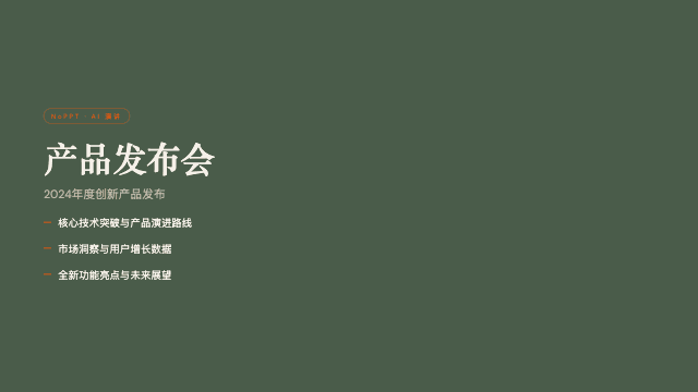
Mat
Mat combines a dark sage canvas with bone paper panels and a burnt-orange accent in a thoroughly mid-century modern register. It feels like a well-furnished studio: tactile materials, honest proportions, nothing ornamental without purpose. The muted palette photographs furniture, ceramics, and interiors beautifully, while the accent keeps navigation through sections crisp. A template for people who notice joinery.
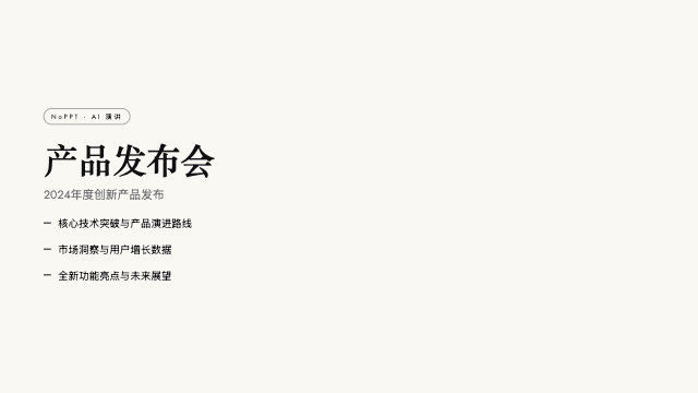
Monochrome
Monochrome is exactly what it claims: ivory ledger paper, all-black type, Lora serif headlines, Jost body text, and no color anywhere. The absence is the statement — with nothing to decorate, every line must earn its place. Despite the minimal surface, it is a high-density template built for serious documents, handling footnote-grade detail without visual fatigue. The most disciplined template in the NoPPT library.
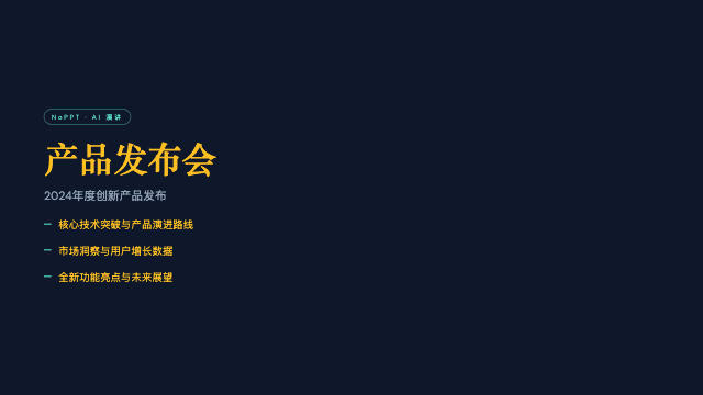
Vellum
Vellum layers warm-yellow Cormorant serifs over a deep navy canvas with one dusty teal accent — scholarly, literary, and quietly authoritative. It reads like the annotated pages of a beloved reference work: low density, deliberate pacing, and typography that rewards attention. Among dark templates it is the contemplative one, built for arguments that deserve to be considered rather than merely seen.
Editorial9 templates
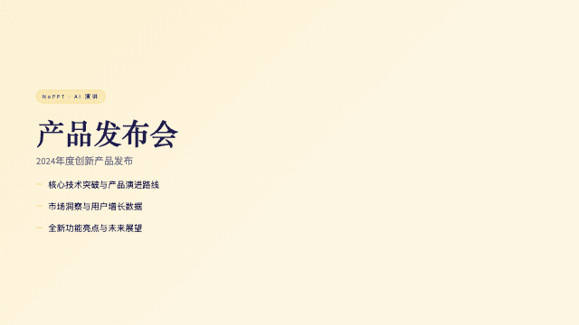
Biennale Yellow
Biennale Yellow pairs a solar yellow accent with warm parchment paper and a deep indigo serif, wrapped in atmospheric sun-glow gradients. The result reads like the printed program of an international art biennale: cultured, warm, and quietly confident. Generous margins and a strict typographic hierarchy keep long exhibition texts legible, while the yellow field gives titles genuine wall-poster presence. NoPPT builds the whole deck for you from a short conversation.
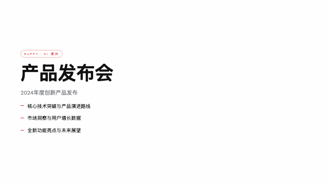
Bold Poster
Bold Poster brings editorial poster aesthetics to the slide format: massive Shrikhand display type, a single fire-engine red accent, and radically low content density. Each slide carries one idea at billboard scale, which forces clarity and gives your spoken words room to breathe. It is the template for statements, not spreadsheets. Describe your message to NoPPT and the AI turns it into a sequence of confident, poster-grade pages.
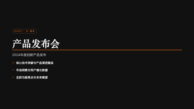
Broadside
Broadside is a dark editorial template with the drama of a newspaper front page: a near-black canvas, one fire-orange accent, and a bilingual Latin-and-Chinese type stack that treats both scripts as first-class design material. Headlines run huge, rules and columns nod to broadsheet tradition, and the single accent color lands like a printed overline. It is among the few templates designed from the start for mixed EN/CN decks.
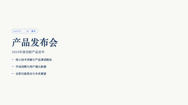
Cobalt Grid
Cobalt Grid sets electric cobalt serifs on a graph-paper canvas, decorated with stair-stepped pixel-glitch details. It reads like a design-research bulletin: studious, modernist, and quietly technical. The visible grid turns structure itself into ornament, which makes methodology sections, system diagrams, and annotated screenshots feel at home. Teams that document as carefully as they design will recognize themselves in this template immediately.
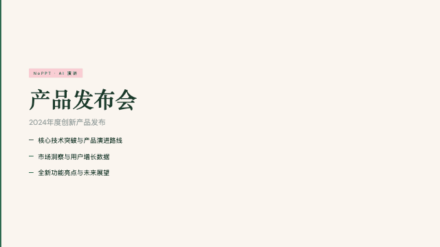
Editorial Forest
Editorial Forest blends forest green, dusty pink, and warm cream under Source Serif 4 for a quiet, considered quarterly-review aesthetic. It is the sound of a team that has done the work and does not need to shout about it. Balanced density fits real reporting — highlights, metrics, learnings, next quarter — while the natural palette keeps two-hour readouts easy on the eyes.
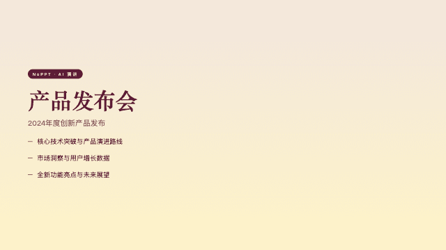
Editorial Tri-Tone
Editorial Tri-Tone composes every slide from exactly three colors — dusty pink, mustard cream, and deep burgundy — set in Bricolage Grotesque and Instrument Serif. The limited palette is the discipline that makes it feel like a fashion magazine spread: intentional, moody, and rhythmic as you page through. Type does the expressive work; color does the emotional work; nothing else is allowed in.
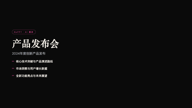
Pink Script
Pink Script is late-night editorial luxury: a black canvas, one hot-pink accent, pearl-cream paper moments, and Instrument Serif headlines. Density stays deliberately low, so each slide feels like a page from a limited-run magazine. The template flatters brands that trade in desire — the pink is glamorous, the black is exclusive, and the serif whispers heritage while everything else stays modern.
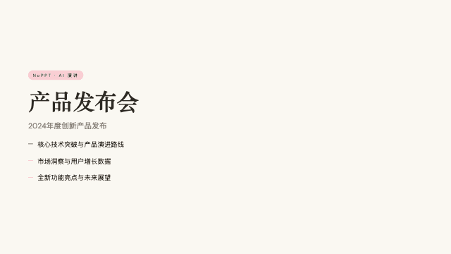
Soft Editorial
Soft Editorial sets Cormorant Garamond on warm paper with sage, blush, and lemon accents — a literary, elegant surface where the serif does the singing. Low density and classical proportions give sentences room to be read slowly, the way essay collections are read. Among light templates it is the most graceful, and it never raises its voice to hold attention.
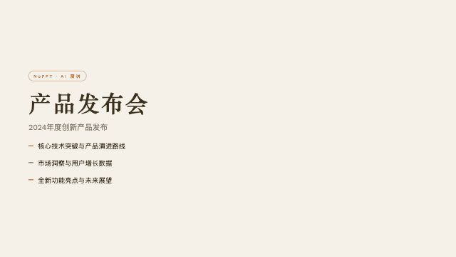
Stencil & Tablet
Stencil & Tablet cuts its headlines from bone paper like archaeological stencils, colored by a six-tone earth palette of ochres, clays, and slates. The effect is archival and tactile — archaeology meets brand identity. It treats content as artifact: sections feel excavated, numbered, and catalogued, which lends historical weight to heritage stories and research. A template that makes time itself part of the design.
Creative9 templates
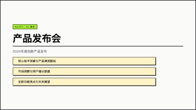
BlockFrame
BlockFrame is a neobrutalist presentation template built from pastel-neon color blocks locked inside chunky black borders. Every element sits in its own frame, so even dense, information-heavy slides stay organized and scannable. The style borrows from indie web design and zine culture: honest, graphic, slightly rebellious, but never messy. It is one of the highest-density layouts in the NoPPT library, generated for you in about five minutes of AI chat.
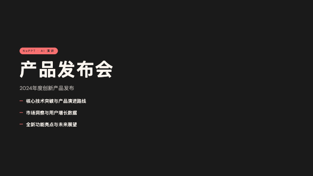
Coral
Coral pairs cream and coral tones against a near-black canvas, set in oversized Bebas Neue capitals. The contrast is bold and warm at once — fashion-lookbook energy with real reading comfort. Big numerals and condensed headlines make stats and taglines hit hard, while the dark ground keeps photography rich and saturated. It is a confident template that flatters brands built on personality.
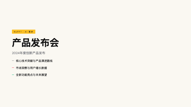
Creative Mode
Creative Mode lays confident multi-color accents over a cream paper canvas, headlined in Archivo Black. It is the template equivalent of a well-run creative studio: energetic but organized, colorful but never chaotic. Medium-high density supports real project walkthroughs — briefs, moodboards, iterations, results — while the black display type keeps every section anchored. A dependable choice when creativity itself is the product you are selling.
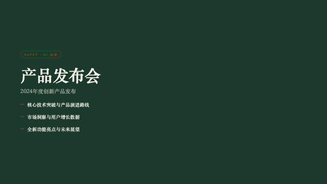
Grove
Grove sets cream type on a forest-green canvas with classical Playfair serifs and a single rust accent. The mood is organic and literary — a walk through managed woodland rather than a hike through wilderness. It carries sustainability narratives and craft stories with unusual sincerity, because the palette itself does half the storytelling. Medium density leaves room for both prose and imagery to breathe.
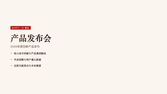
Long Table
Long Table brings warm cream and rust-red supper-club hospitality to the slide format, mixing bold grotesk headlines with Fraunces serifs. It feels like an invitation: convivial, tactile, and quietly stylish, the way a good dinner menu promises a good evening. The layout favors storytelling over dashboards, making event concepts and membership ideas feel already alive before they launch.
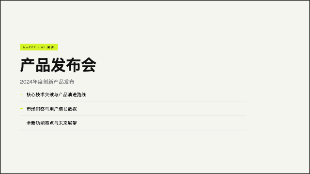
Neo-Grid Bold
Neo-Grid Bold applies editorial neo-brutalism with surgical restraint: off-white paper, hard grid lines, and one neon-yellow accent that lands like a highlighter on the single fact you must remember. High density plus strict structure makes it a stat-machine — numbers, comparisons, and timelines organize themselves. It is loud in exactly one place per slide, which is why the loudness works.
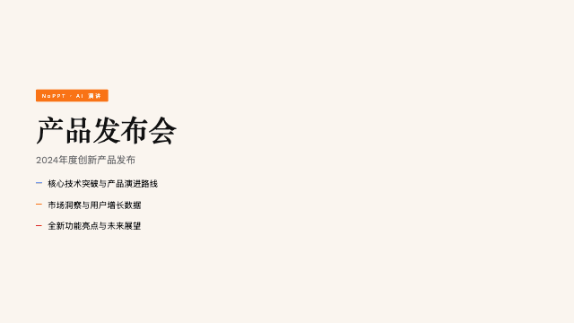
People's Platform
People's Platform channels activist poster energy: blue, orange, and red on cream, headlined in Alfa Slab with Caveat Brush annotations. It speaks in declarations, not bullet points — every slide feels hand-pasted to a wall the night before the march. The honesty of the style builds a specific kind of trust: this presenter believes what they are saying. Use that power for causes that deserve it.
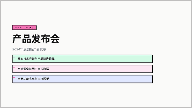
Raw Grid
Raw Grid is neo-brutalism at full commitment: thick borders, offset drop shadows, and a pink-sage-ink palette that refuses to apologize. Structure is celebrated rather than hidden — every card announces its edges, every shadow shows its offset. High density means a single slide can carry a feature matrix, a metric row, and a call to action without breaking. Energy is the default state here.
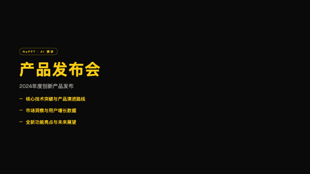
Studio
Studio is high voltage on a black canvas: electric-yellow type at maximum contrast, composed with the precision of a design studio that knows exactly what it is doing. The palette is binary and the confidence is total. Work displayed against this black ground gains instant drama, and the yellow headlines read from across any room. It is a spotlight, engineered.
Retro4 templates
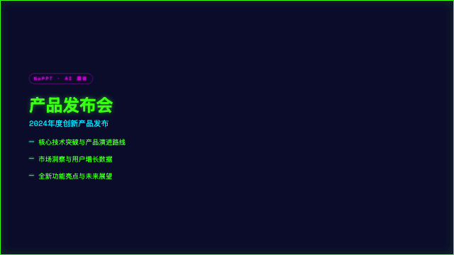
8-Bit Orbit
8-Bit Orbit is a pixel-art presentation template that puts neon arcade energy on a deep navy void. Chunky pixel typography, glowing orbit lines, and retro game HUD details give every slide the feel of a classic console title screen. Despite the nostalgic surface, the layout grid underneath stays modern and readable, so dense technical content, roadmaps, and demo screenshots all land clearly. Generate a full deck in this style through a five-minute chat with NoPPT's AI.
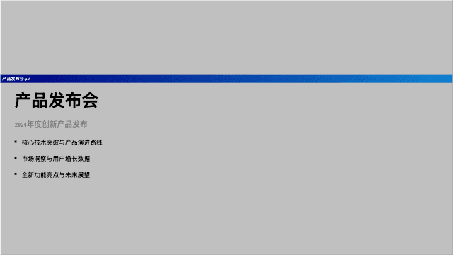
Retro Windows
Retro Windows recreates the Windows 95 desktop as a presentation language: gray title bars, beveled buttons, MS Sans Serif energy, and pixel typography rendered with full nostalgic commitment. Every slide is a window; every section is an app. The joke lands because the execution is precise — this is affectionate homage, not lazy pastiche, and audiences who grew up double-clicking will grin on slide one.
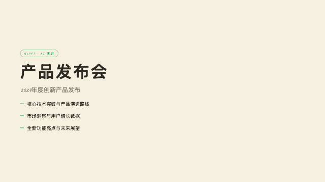
Retro Zine
Retro Zine reproduces the charm of a riso-printed fanzine in HTML: beige paper, a single green accent, Bebas Neue headlines, and Caveat handwriting in the margins. The lo-fi surface carries real editorial structure underneath — columns, captions, pull quotes — so it reads as crafted rather than rough. It gives underground and small-batch projects a voice that big-brand gloss could never fake.
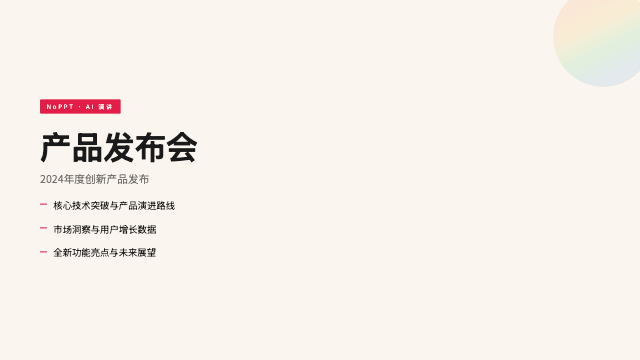
Sakura Chroma
Sakura Chroma revives the vintage Japanese cassette-package aesthetic: cream paper, diagonal rainbow ribbons, and condensed bold type that could sell you a mixtape in 1985. The ribbons create diagonal energy across every slide, while the warm paper keeps the whole thing gentle. It is kawaii-tech done with archival respect — playful, precise, and quietly obsessive about period detail.
Playful5 templates
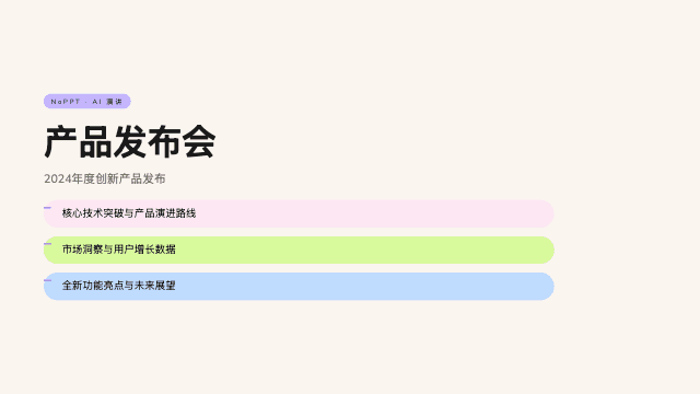
Capsule
Capsule arranges your content in modular pill-shaped cards on a warm bone background, colored with a full pastel-pop palette. The rounded geometry feels friendly and contemporary, like a well-designed lifestyle app brought to the big screen. Each capsule isolates one point, making the template naturally skimmable for audiences who scroll more than they sit. NoPPT generates the entire capsule system from a five-minute conversation about your topic.
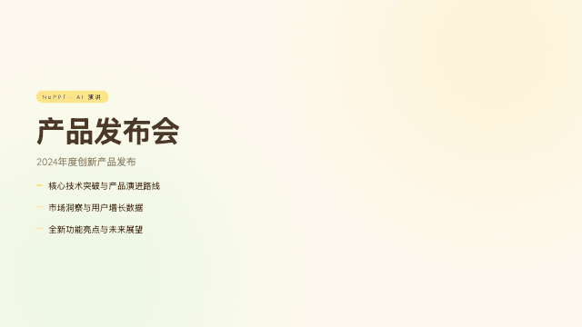
Daisy Days
Daisy Days is a cheerful pastel template scattered with hand-drawn daisies, stars, and rainbows. The illustration style is warm and unpretentious — closer to a beloved picture book than a corporate toolkit — yet the underlying layout keeps lessons and agendas genuinely organized. Sunny colors lower the stakes in the room, which is exactly what teaching and community settings often need. NoPPT generates it all from one short conversation.
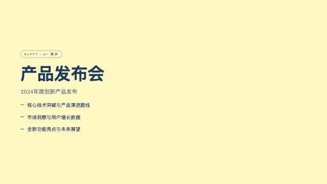
Pin & Paper
Pin & Paper looks like a research wall you can walk up to: yellow paper, safety-pin illustrations, ink-blue Caveat handwriting, and a genuine paper-grain texture. It stages your findings as artifacts — pinned quotes, taped photos, margin notes — which makes qualitative work feel gathered rather than manufactured. The craft aesthetic invites the audience to lean in and read closely.
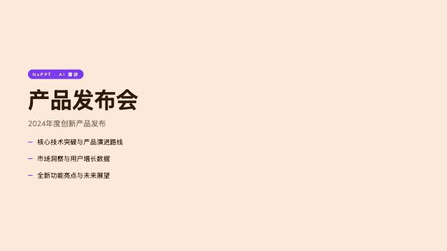
Playful
Playful wraps your story in a sun-warm peach background with the distinctive Syne display face — a friendly indie launch deck that smiles without trying too hard. The warmth is genuine rather than performative: soft contrast, rounded rhythms, and copy-friendly layouts that keep small products feeling human. It is the template for makers who want their work to feel approachable from the first slide.
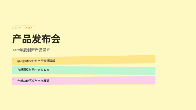
Scatterbrain
Scatterbrain turns the workshop wall into a template: pastel sticky notes, Caveat handwriting, and a Shrikhand-plus-Zilla-Slab type stack that keeps the chaos legible. It is the visual language of ideation — clusters, votes, connections — preserved with enough design discipline to present to stakeholders afterwards. High density is native here, because brainstorms never produce three tidy bullet points.
From Idea to Deck in 5 Minutes
Sign up free for 3 credits and 20 AI edits per project. Generate your first web presentation in any template.
Get Started Free